SaaStock uses two type systems. Tier 1 — Brand is the everyday system for emails, decks, badges, social, product UI, and any page that gets templated. Tier 2 — Editorial is reserved for a small number of high-impact pages where emotional response matters more than systematic consistency. A page is either fully Tier 1 or fully Tier 2 — never both.
Tier 1 — Brand
Rubik + Space Grotesk
The default system. Use everywhere unless the page explicitly qualifies for Tier 2. Warm, modern, templated.
Tier 2 — Editorial
Archivo Black + Geist Mono + Instrument Serif
Industrial, precise, magazine-like. Reserved for flagship event pages, the Our Story timeline, and any page designed to make someone say “I need to be part of this.”
Tier 1 — Typefaces
Two families. Rubik for impact, Space Grotesk for everything else. The contrast between them does the heavy lifting of hierarchy.
Rubik
Display & headlines
A rounded geometric sans-serif with warmth and weight. Use exclusively for display-size text where you need visual impact. Never use for body copy or UI.
Character set
ABCDEFGHIJKLMNOPQRSTUVWXYZ
abcdefghijklmnopqrstuvwxyz
0123456789 &?!@#$%
500MediumH3, card titles
600SemiBoldH2, section headings
700BoldH1, page headlines
800ExtraBoldDisplay, hero, stage
Space Grotesk
System & body
A proportional sans-serif with monospaced heritage. Tabular figures make it ideal for dates, stats, and data-heavy UI. Handles everything Rubik does not.
Character set
ABCDEFGHIJKLMNOPQRSTUVWXYZ
abcdefghijklmnopqrstuvwxyz
0123456789 &?!@#$%
300LightLarge stat numbers (36px+)
400RegularBody copy, nav, descriptions
500MediumActive nav, overlines, captions
600SemiBoldButtons, CTAs
700BoldEmphasis in body (sparingly)
Tier 1 — Type scale
Nine levels cover every surface. Each level locks in font, weight, size, line height, and tracking — pick the level, not the values.
DisplayRubik 800 · 52 / 1.02 · -0.03em
Where SaaS scales
H1Rubik 700 · 40 / 1.10 · -0.02em
Page headline
H2Rubik 600 · 28 / 1.20 · -0.01em
Section heading
H3Rubik 500 · 22 / 1.25 · 0
Card title or speaker name
BodySpace Grotesk 400 · 16 / 1.60 · 0
Body copy carries the substance — bios, descriptions, paragraphs, and the long-form text that makes up the bulk of any page.
Body smallSpace Grotesk 400 · 14 / 1.50 · 0
Secondary text, captions, metadata, and fine print.
Annual hero landing pages for the next flagship event (e.g., `/usa/2027`)
Any standalone page designed to make someone say "I need to be part of this"
Do not use Tier 2 for
Email templates, newsletters, drip sequences
Sponsor decks, partnership proposals
Badge and signage printing
SaaStock Local event pages (use Tier 1)
Blog posts, help docs, support pages
Any page multiple people will update without design review
Tier 2 — Typefaces
Three families. Archivo Black for authority, Geist Mono for precision, Instrument Serif Italic for editorial warmth. Each font occupies a register the others can’t.
ARCHIVO BLACK
Display & headlines
Single-weight ultra-heavy grotesque — the font itself is the statement. Use at 36px+ for maximum impact. Reads as “conference you fly to,” not “product you sign up for.”
True monospace by Vercel. Every character occupies the same width — makes stats feel like a dashboard readout and labels feel like system output. Credibility through typography.
500MediumOverlines, stat labels, nav, badges (uppercase)
Instrument Serif
Editorial accent
High-contrast transitional serif. Used in italic to create tonal contrast — a speaker’s talk title in serif italic under a bold sans-serif name makes the page feel like a magazine feature, not a sponsor grid.
The three-font system works because each font stays in its register. Cross the lines and the page reads as inconsistent, not editorial.
Do
Use Archivo Black exclusively for display and headlines — hierarchy comes from size, not weight
Use Geist Mono for anything that communicates data, system status, or metadata
Use Instrument Serif Italic sparingly — one or two uses per page (subheadline + talk titles) is ideal
Keep Instrument Serif in italic — the roman weight overlaps too much with Archivo in tone
Use Archivo (regular weight) for body copy — it pairs naturally with Archivo Black
Do not
Use Instrument Serif for body, buttons, labels, or navigation — it is an accent, not a workhorse
Use Geist Mono for headlines or body paragraphs — it is for metadata and data
Use more than three instances of Instrument Serif on a single page
Mix Tier 1 and Tier 2 fonts on the same page — pick one system per page
Use Archivo Black at small sizes (12–14px) for dense UI — it overwhelms in long runs
Why three fonts instead of two
The editorial system gives the page three distinct registers. Two sans-serif fonts cannot create this tonal shift.
01 · AuthorityArchivo Black
Industrial weight that communicates institutional scale. “SAASTOCK USA 2026” at 72px reads as a conference you fly to. Rubik at the same size reads as a friendly product.
02 · PrecisionGeist Mono
True monospace for stats and metadata. “1,500+” next to an uppercase mono label reads like a dashboard readout, not a marketing claim. Credibility through typography.
03 · Editorial warmthInstrument Serif
Italic serif as accent. When a talk title appears in serif italic under a bold sans-serif speaker name, the page feels curated, like a magazine feature.
Which tier? Decision tree
When starting a new page, work down this list and stop at the first match.
1
Will multiple people edit this page without design review?
→ Tier 1
2
Is this an email, deck, badge, blog post, or Local event page?
→ Tier 1
3
Is this a flagship event page, the Our Story timeline, or an annual hero landing page?
→ Tier 2
4
Not sure?
→ Tier 1
Cross-tier rules
The two systems do not blend. These are the hard lines.
Never do any of these
Never use Rubik and Archivo Black on the same page
Never use Space Grotesk and Geist Mono on the same page
A page is either fully Tier 1 or fully Tier 2 — no mixing
The footer on Tier 2 pages uses the editorial system, not Tier 1 fonts
Navigation on Tier 2 pages uses Geist Mono, not Space Grotesk
Implementation
Drop these snippets into any SaaStock surface. CSS variables keep both tiers consistent across products.
10%#F0E8FELight backgrounds, featured section fills
40%#BD97FBHover states, secondary accents
100%#7B2FF7Primary purple
75%#5C23B9Text on purple 10% backgrounds
50%#3E187CDark text on purple fills
25%#1F0C3EDarkest purple
Contrast ratios
Tested pairings. Do not use unlisted combinations without verifying contrast.
PairingRatioVerdict
AaWhite on Night
18.1:1Pass (all sizes)
AaWhite on Deep navy
16.4:1Pass (all sizes)
AaIce on Night
13.2:1Pass (all sizes)
AaIce on Deep navy
11.9:1Pass (all sizes)
AaCyan on Night
10.3:1Pass (all sizes)
AaMagenta on Night
4.6:1Fail — too hard to read
AaPurple on Night
3.5:1Fail — too hard to read
AaNight on White
18.1:1Pass (all sizes)
AaNight on Warm white
16.8:1Pass (all sizes)
AaNight on Cyan 10%
16.8:1Pass (all sizes)
AaSlate on White
4.6:1Large text and captions only
AaSlate on Warm white
4.2:1Large text only
AaCyan on White
1.8:1Fail — never use
AaMagenta on White
3.5:1Fail for body text — display only
Tiered color system
Three attendee tiers, three palettes. Subtractive logic: the higher the tier, the darker and quieter the palette. Fewer colors signals more status.
EXECUTIVE
Jamie Rivera
CEO · Linear
Tier 1
Executive
Private, quiet, exclusive. The black card.
Badge top
#161B2E
Badge bottom
#0D1117
Accent
#A5F3FC
Secondary
#7B2FF7
Lanyard
#161B2E
Allowed Deep navy · Night · Ice · Purple · White
FOUNDER
Jamie Rivera
CEO · Linear
Tier 2
Founder
Bold, confident, energetic. The main event.
Badge top
#0D1117
Badge bottom
#FFFFFF
Accent
#00C8C8
Secondary
#E91E8C
Lanyard
#0D1117
Allowed Night · White · Cyan · Magenta · Purple · Slate
GENERAL
Jamie Rivera
CEO · Linear
Tier 3
General
Simple, functional, accessible. The entry point.
Badge top
#F4F1EC
Badge bottom
#FFFFFF
Accent
#6B7280
Lanyard
#FFFFFF
Allowed Warm white · White · Night · Slate · Light slate
Color rules
The brand reads as brand because of restraint. These are the hard lines.
Do
Use brand colors (cyan, magenta, purple) only as accents — never as large background fills
Pull backgrounds from the neutral set (Night, Deep navy, Warm white, White)
Use Ice (#A5F3FC) as the primary accent on dark backgrounds for projector-safe contrast
Use Night or Deep navy backgrounds for max contrast at distance (banners, signage, stage)
Stick to the published tint/shade ramps — never invent off-ramp values
Do not
Never use cyan on white as text or UI (1.8:1 — fails accessibility)
Never use magenta or purple as text on Night or Deep navy — both fail readability (4.6:1 and 3.5:1)
Never mix tier palettes on a single asset (Executive ≠ Founder ≠ General)
Never put white backgrounds on outdoor banners — they wash out and show dirt
Print & projector guidance
Color behaves differently across substrates and screens. These rules keep the brand consistent off-pixel.
Large format banners (40ft+)
Supply CMYK from this guide, not hex conversions. Press-proof on the actual substrate before approving a full run.
Cyan shifts warm on uncoated stock. If proofs look green-yellow, increase the cyan channel 5–10%.
Purple can shift blue on some stocks — add 5% magenta to the CMYK mix if proofs skew cool.
White on Night is readable from 100+ feet. Avoid white backgrounds outdoors — they show dirt and wash out.
Minimum text at 50+ feet: 6 inches tall for body, 12+ inches for headlines.
Projector slides
Projectors wash out 20–40% of saturation. Dark backgrounds (Night, Deep navy) perform significantly better.
Use Ice (#A5F3FC) as the primary accent on dark — holds 13.2:1 on Night even after washout.
Never use magenta or purple as text on Night or Deep navy at any size — both fail readability (4.6:1 and 3.5:1). Fills, chart colors, and graphic accents only.
For breakout rooms with light backgrounds, use Night text on white or Warm white.
Badge cards
Print at 300 DPI minimum. Logo ring at ~20mm requires the full three-color version.
Dark badge tops (Executive, Founder) read better in dim conference lighting than white badges.
General tier badges use light backgrounds — an intentional downgrade in low-light readability that reinforces hierarchy.
Tier differentiation must be visible from 20+ feet. Lanyard color is the primary distance signal.
Implementation
Drop these CSS variables into any SaaStock surface. One source of truth for every brand color.
Two lockups, two formats each. Use SVG by default — it scales cleanly from favicon to billboard. Use JPG only when SVG is not supported (some email clients, legacy decks).
Light background
Dark background
Primary lockup
Mark + SAASTOCK wordmark. Use as the default brand signature on web, decks, sponsor materials, and any surface with horizontal space.
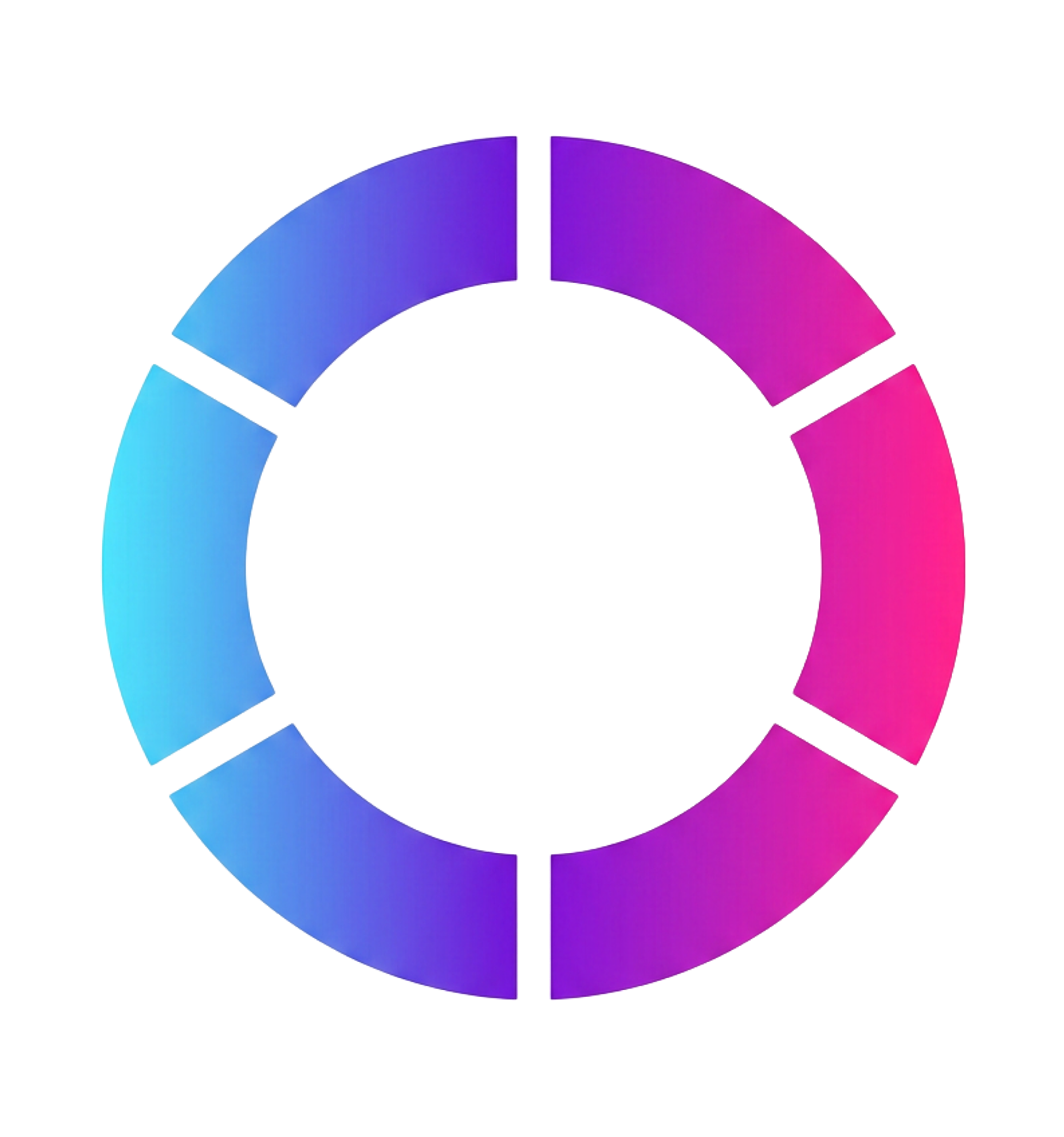
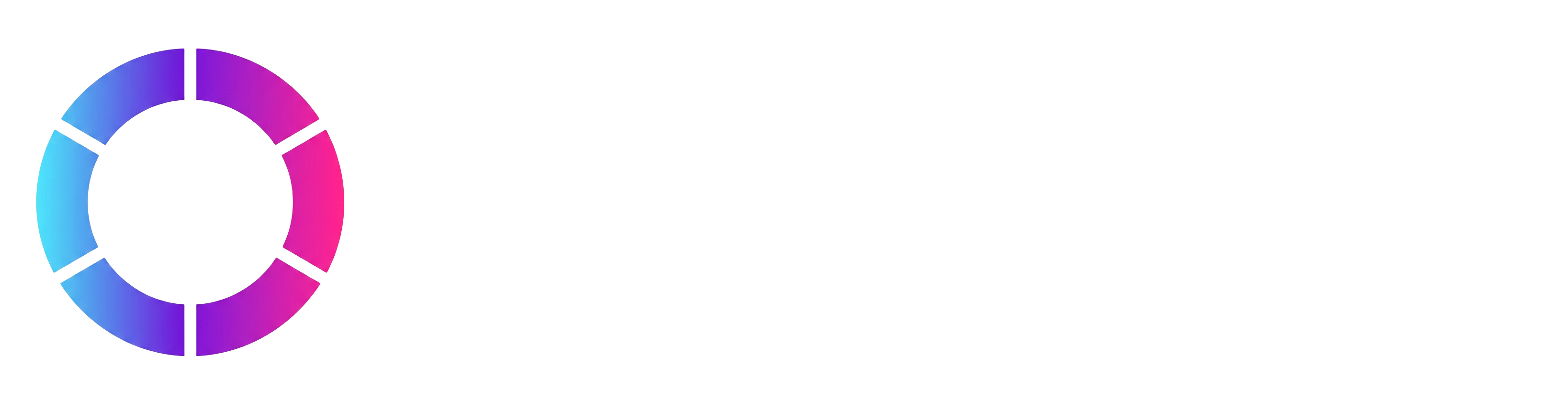
The standalone ring mark. Use for avatars, favicons, social profile pictures, app icons, and tight spaces where the wordmark would shrink below 80px wide. Use the gradient version on light backgrounds and the all-white version on dark backgrounds.
The mark is the most identifiable element of the brand — protect it. These rules keep the logo recognizable everywhere it appears.
Do
Use the full-color SVG whenever possible — it scales cleanly to any size
Maintain clear space around the mark equal to the height of the ring
Use the icon mark only when the wordmark would shrink below 80px wide
Place the logo on white, warm white, or Night backgrounds — see brand colors
Do not
Do not recolor the gradient — the cyan/magenta/purple ring is fixed
Do not stretch, skew, rotate, or add drop shadows to the logo
Do not place the logo on busy photo backgrounds without a solid plate
Do not pair the SAASTOCK wordmark with a separate tagline lockup
Speaker badge generator
Type a speaker name and title — get a brand-correct PNG badge on demand. Uses Rubik for the name (per the type spec) and Space Grotesk Medium in magenta for the title. Exports at 1200×1800 (print-ready at 4×6 inches @ 300 DPI).
Global rules
Brand-wide rules that apply to every page, every asset, every tier. These sit above the typography and color systems — when in conflict with a tier-specific recommendation, the global rule wins.
Iconography & emoji
SaaStock is a brand that should feel like an institution. Emojis render inconsistently across Apple, Google, Windows, and Twitter, break our typographic hierarchy, and read as informal. We do not use them — anywhere.
Do
Use country names as plain text — no flag emojis
Use icons from the SaaStock icon set (lucide-react) for status, navigation, and UI affordances
Punctuate visually with a brand-color dot, an underline, or whitespace — not a symbol
Strip emoji from copy pulled in from external sources (Slack, Twitter, registration forms)
Do not
Use emoji in headlines, body, button labels, badges, or signage
Use 🇺🇸 or any flag emoji for countries — they render inconsistently across platforms
Use ✅ ⚠️ ❌ for status — use a lucide-react icon in brand color instead
Use ✨ 🔥 🚀 or any tone accents — they read informal in a brand that should feel institutional
Numbers next to labels
When a number sits inline next to its label — country counts, bar values, seniority tallies, “Plus N more” footers — the number must use the same font family AND the same weight as the label. Contrast comes from size or color, never from a weight gap.
Do
Match the number's font family AND weight to its label when they sit inline (within a card row)
Use contrast of size or color — never a weight gap — to separate label from value
Reserve Space Grotesk Light 300 for OVERSIZED stat numbers (36px+) only
Do not
Pair a Space Grotesk Medium 500 label with a Space Grotesk Light 300 value at 13–22px — reads as two different fonts
Use Light 300 for inline counts in tables, country lists, bar charts, or seniority tallies
Bold a number to make it pop next to a regular-weight label — same family/weight, bigger size or accent color instead
Why:Space Grotesk Light 300 is reserved for oversized stat numbers (36px+). At 13–22px it loses contrast against Medium labels and the eye reads it as a font mismatch, even though it’s the same family. Same rule applies to Archivo weights in Tier 2.
Summary footers
When a card ends with a quiet summary line — “Plus 22+ more countries represented”, “Plus 806 more SaaS companies in the room” — that line must anchor to the bottom of the card. When cards sit in a row at different content heights, the summary lines need to align across the row.
Do
Anchor summary footers ("Plus N more …", "Plus N more countries represented", etc.) to the bottom of their container
Use a flex column on the card and margin-top: auto on the footer line
Keep summary footers in --muted at 12px Space Grotesk Regular (Tier 1) or Geist Mono Regular (Tier 2)
Do not
Let summary footers float directly under variable-height content — they will sit at different heights across cards in the same row
Use bottom: 0 absolute positioning — that breaks when content reflows on narrow viewports
Promote summary footers to a heading or pill — they are quiet metadata, not a callout
Lists of names
Sponsor lists, notable-company lists, attendee call-outs — anywhere we surface a roster of names. Past ~5 items, vertical stacking in a 3-column grid scans faster than a horizontal comma-separated run.
Do
Lay out lists of names (companies, sponsors, attendees) as a 3-column grid, left-aligned per column
Use Rubik 500 / Archivo 500 at 18px for company-name lists
One name per row inside the grid — vertical stacking is more scannable than horizontal flow
Do not
Use horizontal comma- or dot-separated runs once a list passes ~5 items
Mix logos and plain-text names in the same list — pick one mode per surface
Center-align names inside narrow columns — the ragged left edge breaks scannability
Side event descriptions
On every event page, the Side Events & Experiences grid sits 3-up. Description copy inside each card is capped at four lines — once one card spills past four lines, the row goes uneven and the section loses its rhythm. This is a global rule across every past and upcoming event page, Europe and USA alike.
Do
Cap every Side Events & Experiences description at four lines — write to the cap, not past it
Use -webkit-line-clamp: 4 on .ep-related-desc as a safety net (paired with -webkit-box + overflow:hidden)
Push longer prose (narrative, context, multi-paragraph recaps) into the editorial recap section instead
Do not
Let one card's description run five or six lines while the others sit at two — it breaks the 3-up grid rhythm
Rely on the line-clamp to hide overflow content — readers should never feel a sentence got cut off
Treat the rule as event-specific — it applies globally to every event page, past and upcoming, Europe and USA